![](https://images.squarespace-cdn.com/content/v1/64b8ccb465fbff0c811af994/1690092401608-8Z2LHV9GTM0JSKWH13AA/Metallic_Water_Bottle_MockupsForFree.png)
On The Move
Brand Identity
Logo Design
Pattern Design
Social Media Content
Packaging
The Brief
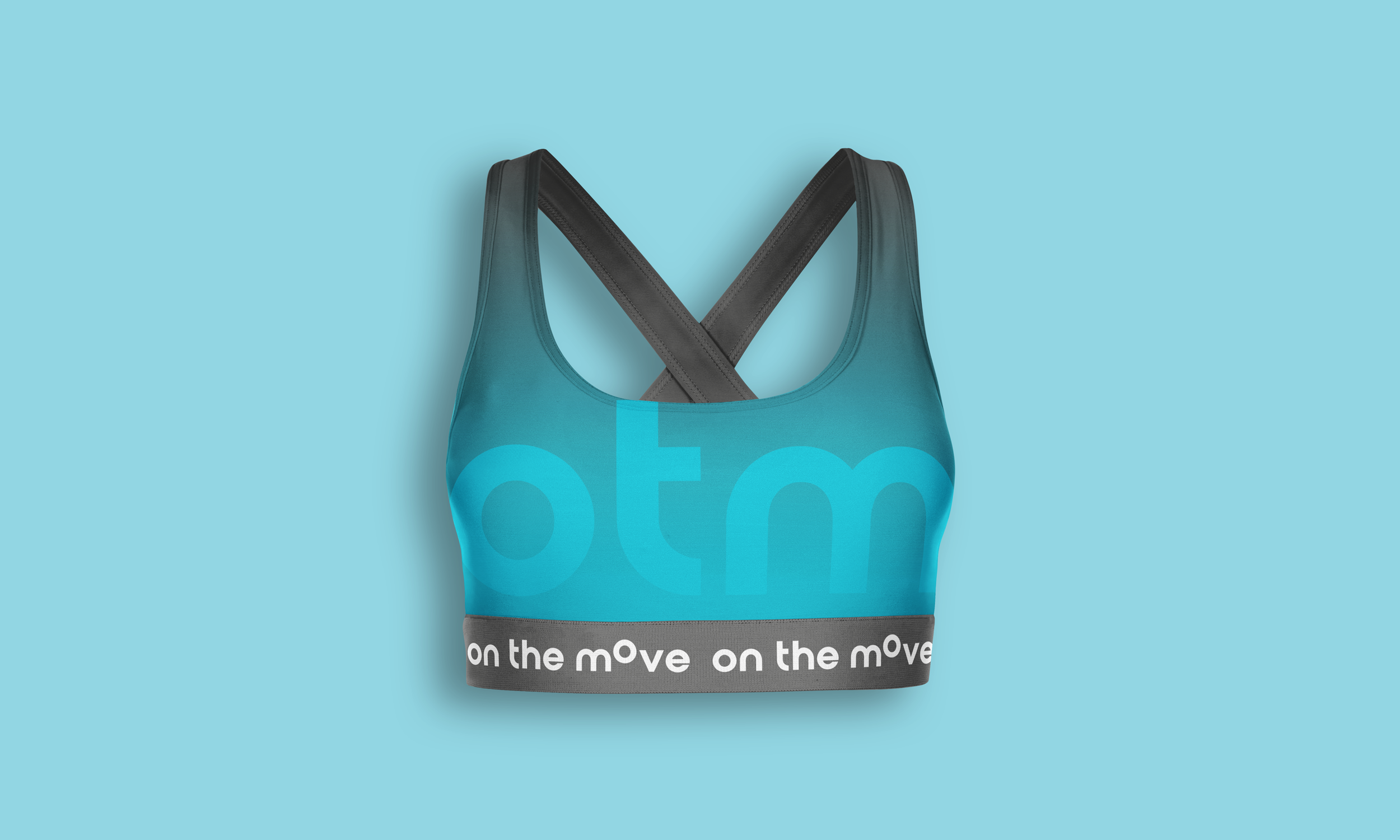
Update exisiting logo to something more modern but must indicate movement in some way to coincide with the name of the business. Keep exisiting colour palette.
Design Outcomes
Simplicity is best when branding which is evident in the outcome of On The Move’s new identity. Movement was indicated in the most simplest form with the ‘O’ paired with a bold typeface representing strength. The curves of the letters making this identity less masculine like other gyms, more inclusive.
![shot_02.png](https://images.squarespace-cdn.com/content/v1/64b8ccb465fbff0c811af994/a24411e1-dcee-4da5-89f8-5c8161d12814/shot_02.png)
![7.png](https://images.squarespace-cdn.com/content/v1/64b8ccb465fbff0c811af994/415781d9-b453-43ad-910a-7541b8368634/7.png)
![Social-Mockup-5.png](https://images.squarespace-cdn.com/content/v1/64b8ccb465fbff0c811af994/310107dd-da24-462b-9aad-664814bb0fb0/Social-Mockup-5.png)
![Front.png](https://images.squarespace-cdn.com/content/v1/64b8ccb465fbff0c811af994/0e6431f6-9399-4c08-a762-7a98b62c8cf4/Front.png)
![Leggings-grey.png](https://images.squarespace-cdn.com/content/v1/64b8ccb465fbff0c811af994/f32cd5d1-0957-429d-9b7f-9926b5ca66f0/Leggings-grey.png)
![Drawstring_Bag_MockupsForFree.png](https://images.squarespace-cdn.com/content/v1/64b8ccb465fbff0c811af994/76117a4d-20c1-4334-90bb-f32b9ebc2a68/Drawstring_Bag_MockupsForFree.png)
![Metallic_Water_Bottle_MockupsForFree.png](https://images.squarespace-cdn.com/content/v1/64b8ccb465fbff0c811af994/fb5cb11c-a884-4ad2-aa62-5f23d8c4a88b/Metallic_Water_Bottle_MockupsForFree.png)